Challenges
Adapting the design to the extremely simple taste of the client. She refused to use display fonts or anything exotic in an effort to keep her concept as simple as possible to focus on the the items and not on the branding itself.
Concept
In today’s world, where body positivity is significant and influential, Beneath the Surface gives a new meaning to perception.
Enabling women to be who they want to be, achieve personal fulfilment, know their strengths and be at ease within their own bodies both internally and physically is our ultimate goal.
Perception has always been deeper than vision because it all starts with falling in love with who you are Beneath the Surface.
Design Decisions
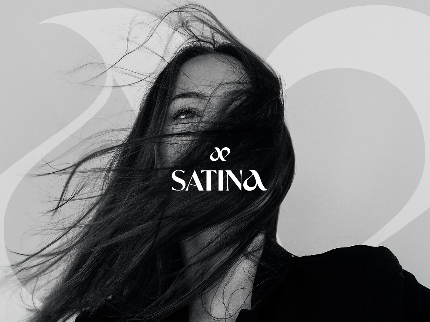
Keeping the whole brand black and white goes hand in hand with the client’s idea of only having black and white intimates, and really focusing on construction and intricate details.
The font was as simple as the client wanted it to be, there was very little leeway on that front.
The use of the circle made the logo interesting because it could read “Beneath the Surface” as well as “The Surface Beneath”, which the client loved.
Results
Visual identity ○ Packaging

